

English >> 日本語
HOUGAN
As the name "HOUGAN(grid)" suggests, all dots are arranged on a grid, and all diagonal lines are 45 degrees. As a result, when the letters are lined up, the lines line up, creating a figurative typesetting.
A typeface is designed to harmonize with whatever type of text appears next to it. "HOUGAN" is a typeface that particularly emphasizes this point.
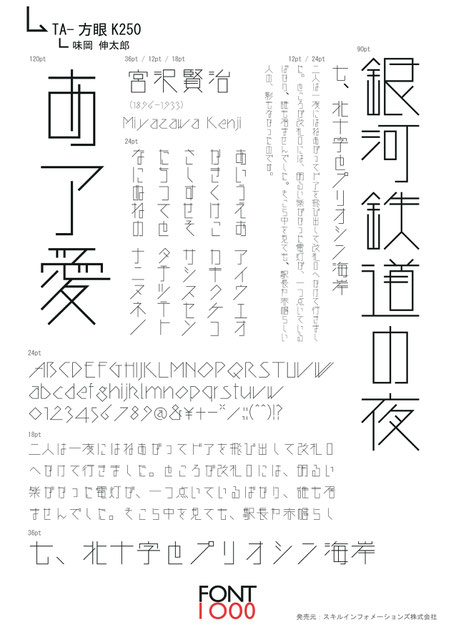
The Hougan family has linear gothic (K) and rounded gothic (M) styles, each of which includes the following four weights 250, 375, 500, 625 (the larger the number the heavier the weight). K500 is one of the linear style gothic fonts.
This font contains 2,286 characters from the Joyo Kanji List and Jinmei-yo Kanji characters, as well as additional 206 characters including kana characters, punctuation marks and Latin characters, etc.
Designed by Shintaro AJIOKA
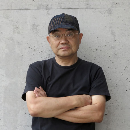
Ajioka was born in Toyahashi City, JAPAN in 1949.
He lives the principle expressed by the painter Takeo Yamaguchi: “If you are involved in design, your art will connect with society. Walk the line between fine art and design.”
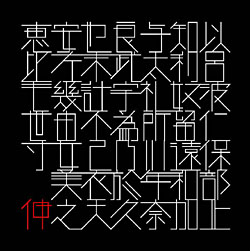
Ajioka uses his own typefaces for all his graphic design work. To date, he has designed around 150 typefaces.
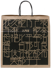
In 2001, he formed the publishing house “Haru-natsu-aki-fyu-sousho”.
At that same time, he published and exhibited his contemporary art at galleries and fine art museums both in and outside of Japan.

To USE
Adobe Fonts library >>
Download by MOJI >>
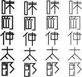
方眼
「方眼」はその名からも分かるとおり、方眼上に全ての点画が配置されている、そして斜線は全て四十五度である。その結果、文字が並んだときにラインが揃い、造形的な組版が生まれる。
隣にどのような文字がこようとも、調和するようにデザインされるのがタイプフェイスだ。「方眼」は特にその点を強調した書体である。
方眼 ファミリーには、線形ゴシック (K) や丸みを帯びたゴシック (M) 体があり、それぞれに 250、375、500、625 (数値が大きいほどウェイトが太くなります) の 4 ウェイトが含まれています。K500 は線形スタイルのゴシックフォントの 1 つになります。
このフォントには、2286 文字の常用漢字と人名用漢字があり、かな文字、約物やラテン文字などを含む 206 文字が追加で含まれています。
1949年、豊橋市生まれ。
「美術に係わることでデザインが大衆に迎合せず。デザインに係わることで美術が社会との接点を見失わずにすむ。美術とデザインが造る山の稜線上を歩け。」画家・山口長男の言葉が活動の基準。
1984年、かな書体「小町・良寛」をデザイン。自作のタイプフェイス及び関係した書体で、全てのグラフィックデザインを制作。2018年、見出し明朝体「味明」2種と仮名10種を制作。これまでに漢字と仮名書体合わせて約150書体を発表。
2001年、郷土の記録を残すため、出版社「春夏秋冬叢書」設立。出版物は全て自身でデザインした書体/フォントを使って制作。

ドイツの出版社が出版する日めくりカレンダー:タイポダリウム(Typodarium)2025の1ページに「方眼フォント」が選ばれました
